This summer Canvas released a new look for the Canvas Dashboard – aka landing page, “User Interface” (UI). You will see this new page when you log into Canvas on Wed., Sept. 9.
WHY this change? This design is more “responsive” and, as a result, Canvas works better on a wider range of computer devices including smart phones and tablets.
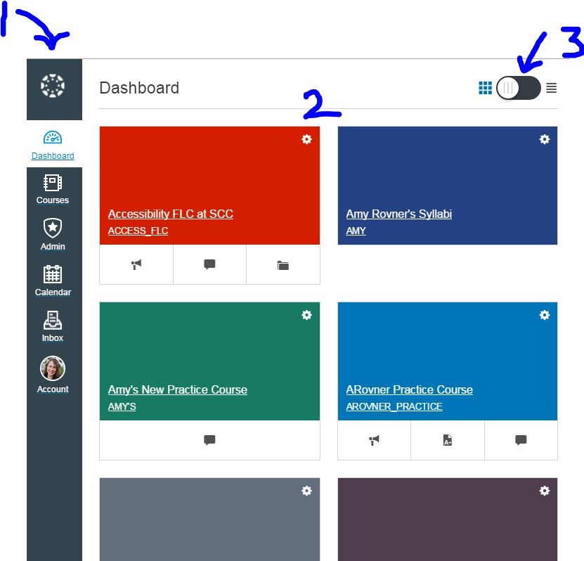
Please note the main changes:
• The buttons that used to be at the top of your Canvas screen now run down the lefthand side. This was done to give more room to the actual Canvas content pages (Please see #1 in the image above).
•The Dashboard used to show a list of “Recent Activity”. It now shows the courses that you have put into the “Courses” dropdown menu. These are represented by the colored tiles (See #2 in above image). If you prefer the list of Recent Activity, you can “toggle” the tile view back to a list view using the button at the top of the page (See #3).
PLEASE NOTE:
•If your Canvas page is reduced in width, the course menu will be hidden and replaced with three horizontal lines on the top breadcrumb trail. Click on the icon to bring it back.
•The Help button is now located at the bottom of the lefthand navigation menu, and links to our Shoreline Canvas 24/7 Help are still at the bottom of each page.
Here is a link to a short captioned video showing you how it works.
Other than the menu remaining on the far left, this change will have no impact on your course design, content or how things function once you and your students are inside your classroom. It only impacts the Canvas Dashboard.
Please join us for our eLearning Open House during Opening Week when we will be offering demos and more information. Details to be announced soon.
Let us know if you have any questions!
Thank you!
Your eLearning Team

Leave a comment